Fonts are important because they aren't the content itself but they are deeply tied to the content in our minds. For longer works, the best fonts are "transparent," in this case meaning they don't distract the reader from the content itself (and in many ways the best fonts actually help the reader along without the average reader even knowing it). The most readable fonts like this are called old style fonts. For titles and design, the best fonts reflect the content in some way--think "Happy Halloween" in a font that looks like it's dripping ooze of some kind. Fonts like this are often called display fonts.
In videogames, the controls are in many ways the "font" for the medium. While this may not make sense at first, consider how the controls sit in exactly the same place between the content and the user as fonts do. Fonts aren't content, but they link the user to the content and help shape the user's experience with the content. Similarly, the controls for the game aren't the game itself, but they're the crucial link between the player and the content of the game. Just like good fonts, good controls are transparent--they get out of the way and let the user experience the game without having to work too hard to get through the controls to the game itself.
 |
| A Halloween-themed display font |
I would argue that some controls are "display font" controls--the controls themselves attempt to mimic the content in some way--and some controls are "old style font" controls, meant to just let the user pass through them to the content without distraction.
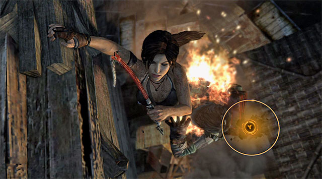
On the "display font" end we find stuff like the Wii remote motion controls and QTEs (quick time events). These controls try and immerse the player in the moment by making them somehow mimic the action of a character within the game. When a zombie's trying to push through the door, for instance, and the game prompts you to push a single button repeatedly as fast as possible, the designers are trying to pass the feeling of urgency and strain to the player through the controls. As the character pushes frantically, the player pushes frantically. This is very similar to the idea of display fonts--what's seen reflects what's read.
On the "old style font" side we find thumb stick controls and dedicated buttons. Little thought and effort go into pushing the stick forward to moving the character forward. The controls are transparent--they get out of the way and let the player get immersed in the game world. When a player knows the triangle button is going to pick up an object, he or she no longer looks at onscreen prompts and just pushes the button when the character nears an object. These controls get out of the user's way and don't call attention to themselves, letting the content through to the player easily just like old style fonts.
 |
| Screenshot of Tomb Raider showing a QTE in which the player must "hold on" to the ledge by repeatedly pressing the "Y" button (image credit: gamepressure.com) |
Not only does this help us read individual games, but it helps explain recent trends in the gaming industry. Nintendo has always been the "family friendly" gaming system, but in the past there were always at least a few more mature titles for their consoles. The Nintendo 64 was meant for kids, but it still had James Bond games. The Wii, however, is nearly devoid of any serious or mature titles. As a result, "core" gamers have all but left Nintendo behind, something the company tried to fix with the Wii U by attracting more mature titles like Batman: Arkham City and Assassin's Creed IV: Black Flag to the system. But why did Nintendo lose this market in the first place? Because the Wii is inherently "display font"-control oriented. When motion controls are added to the mix, suddenly everything about the game becomes about imitating with your body what you see on the screen, and that interface becomes the whole enjoyment of the experience rather than the content itself. To use our analogy, playing a serious game like The Last of Us with a Wii remote would be like reading the entirety of Cormac McCarthy's The Road in a font with little cartoon zombies peeking around the letters. If Nintendo wants to bring back "core" gamers, they need a way to provide more transparent controls, not more gimmicky ones.
This analogy also explains why developers continue to use QTEs in games despite increasing player complaints. From a developers' point of view, a QTE is attractive--it cleanly and efficiently brings up a sense of urgency and allows for very a cinematic moment that still requires player interaction, thus looking and feeling like a movie while superficially remaining a game. From the players' perspective, however, it calls too much attention to the controls and actually pulls them out of the game world to deal with the physical demands of the controller. (Also, QTEs quickly become cruelly repetitive and eliminate strategy, but those are different issues.) Like display fonts themselves, QTEs can be emotionally effective when used sparingly and intelligently, but too many just distract from the content and cheapen the experience of the game.
Obviously, this analogy can't be taken too far, but it's useful in both designing and playing games to create more exact and emotionally effective communication. Intelligent controls can be the cherry on top of a great game (I'm thinking of Batman: Arkham Asylum/City's amazing Freeflow Combat controls) or they can be the reason a great concept becomes a trashed title (as was the frustrating and unfortunate case with the in-line skating/graffiti game Jet Set Radio).
So, next time you're playing or designing games, take a second and consider what font they're in.
No comments:
Post a Comment